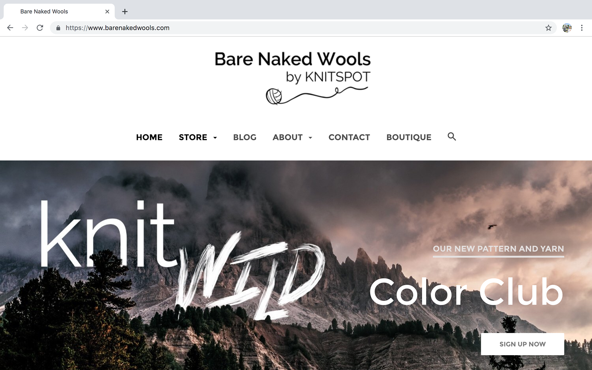
In part of a rebrand for Bare Naked Wools, I redesigned their website, as well as their logo. They desperately needed an updated web design with a more user friendly, intuitive and streamlined experience for their shoppers. To do this, I opted for simplicity and minimalism. The homepage features an image slideshow that displays current subscription clubs, along with a clear, concise and centrally located menu to navigate the site.
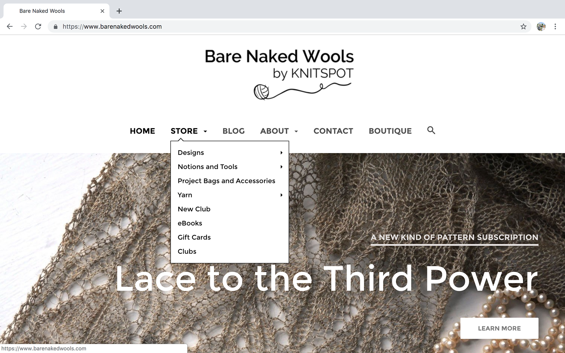
Once you click on the desired menu, you are given a drop down option displaying the categories within that menu.
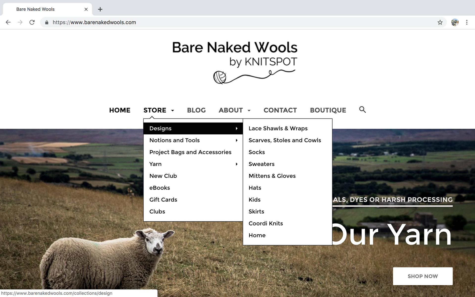
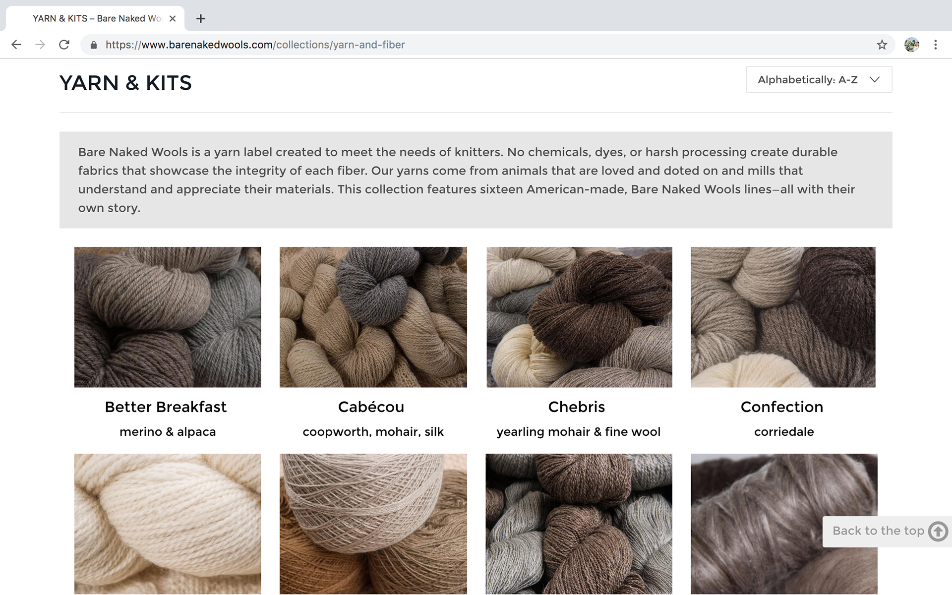
Since the names of the yarns are unique and not named after the breeds from which they're made, I wanted a page that showed all the yarns lines, as well as the dropdown menu.
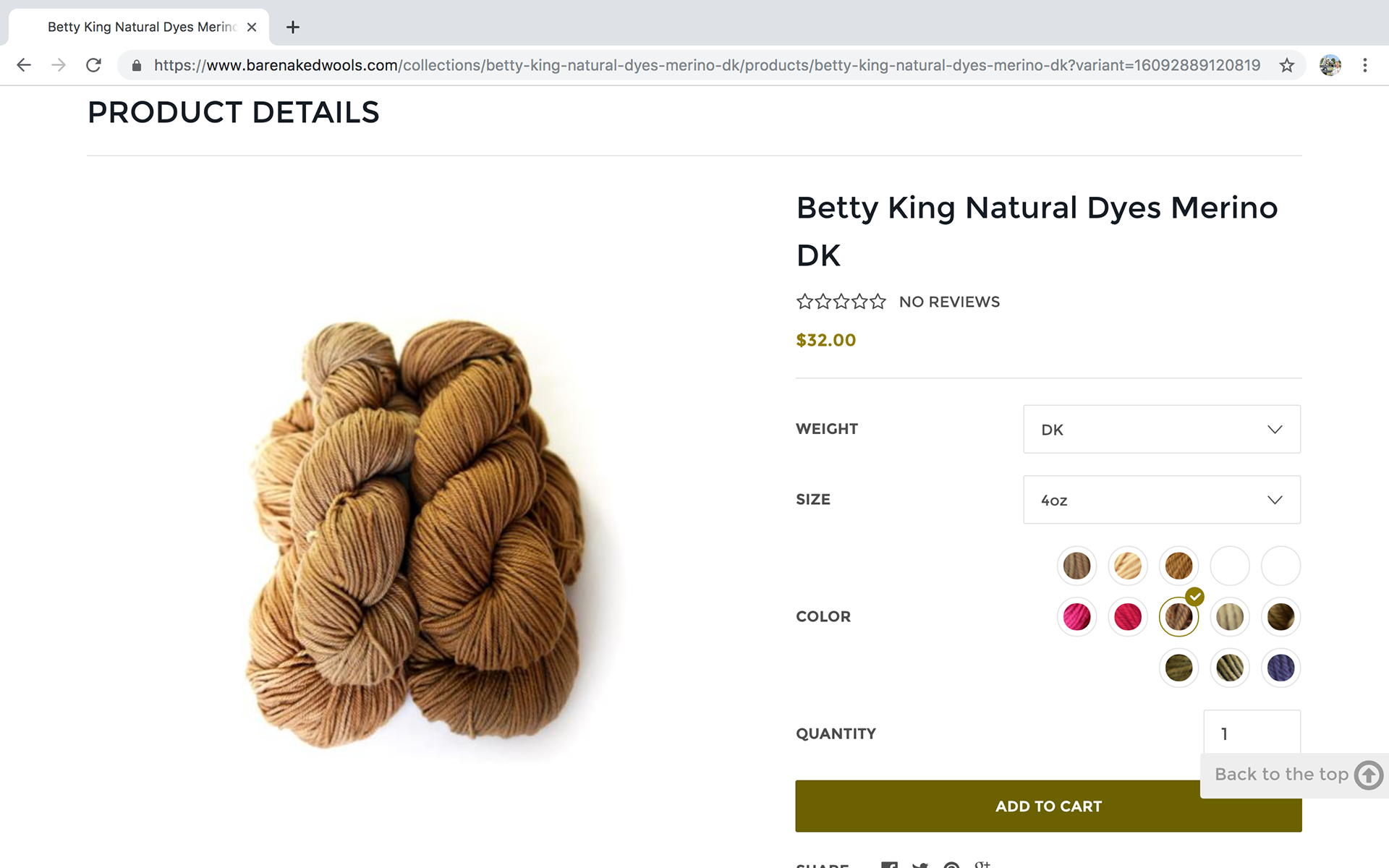
If you click on "yarns" you will be taken to this collection page that gives a brief description of each blend, as well as a detailed image. Then when you click on the specific yarn, the shopping page is clean, clear and easy to navigate. You can view the website here.
Finally, once you get to the individual product pages, I wanted the hierarchy to focus on detailed product imagery. Since this is a very tactile product, the closest you can come to feeling it is through a really great photo.
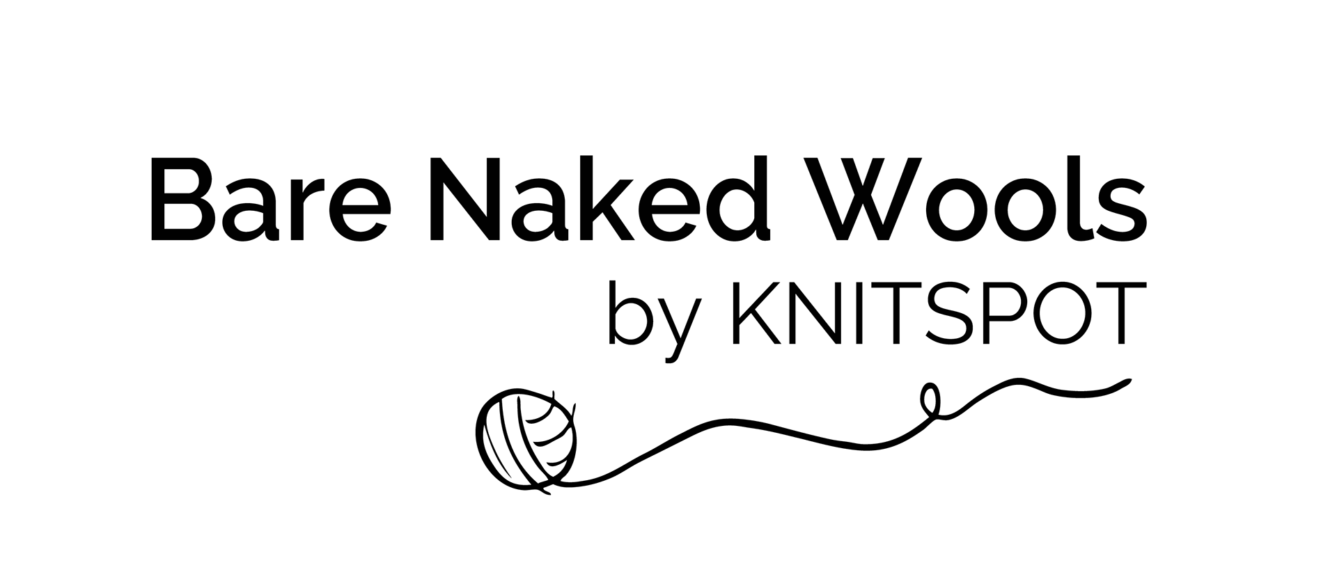
I also redesigned the logo, giving it an updated type treatment. I incorporated a loose, carefree drawing of a ball of yarn so that it relates more to the yarn industry than their prior logo did. I kept it clean and simple to represent and align with the core values of the Bare Naked brand of natural, un-dyed and socially conscious yarns.